by Sarah Purdy and Alexis Thomas
As we ring in 2021, businesses are considering where to invest their marketing budgets. Like everything else in 2020, PPC was disrupted. As the world adjusts to the lingering pandemic, people continue to spend more time and money online, making PPC a clear front-runner to claim those marketing dollars.
There will be plenty of changes for PPC managers to contend with in 2021, like more automation and less data availability. Check out this in-depth article from the Search Engine Journal to dive into that.
When optimizing ads behind the scenes for these changes, it could be easy to forget another, equally important piece of every PPC campaign: the landing page. Writing and designing a landing page that speaks to your audience will be more crucial than ever in 2021 because it’s highly likely data-focused strategies will become more limited.
Before we move on, let’s define what a landing page is. A landing page is a standalone webpage created specifically for a marketing campaign. It’s where potential customers end up when they click on your ad. As a rule, it’s more effective to link to a landing page than a standard page on your website because:
- Your landing page will be designed to achieve the goal of your marketing campaign.
- Tracking data generated by your campaign is a cleaner process on a landing page. You can see if someone downloaded a PDF or filled out a form, for example. All your landing pages can be compared, so you can see what’s effective.
To help you get the most out of your PPC campaign, we’re sharing our list of best practices for creating a landing page your audience will relate to.
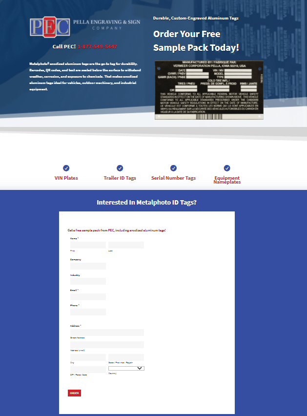
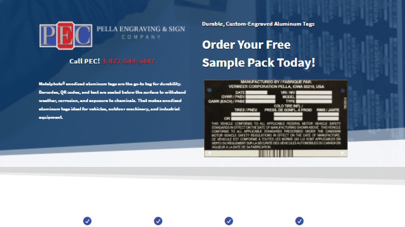
Here’s a landing page the Write Place built for Pella Engraving & Sign Company—notice the call to action is front and center?
Before You Start
- Know your goal. What do you want visitors to do when they reach your landing page? Will they buy something, fill out a form, set up a consultation? Clearly define what action you want them to take, then gear the text and design of your page toward that goal.
- Know your audience. Picture your ideal customer—everything from their budget to their location and goals. If you know who you’re talking to, you’ll build your landing page to meet their wants and needs.
- Know your competition. Find out who’s offering something similar. Look at their ads and websites and envision how your site will compete. Is there anything you can learn from your competitors’ successes or shortcomings?
Writing Your Landing Page
- Keep it short, sweet, and scannable. Did you know the average human attention span is just 8 seconds? Your page needs to instantly make an impression, so cut the fluff and focus on the essential information your audience is looking for. Don’t overwhelm them with large blocks of text. Use short paragraphs, headings, and bulleted lists that are easy to scan.
- Benefits sell. Features, less so. It’s easy to list product features, but take the time to tell your audience what good they will get out of your product or service. How will they be better off?
- Make your call to action clear. Your audience should immediately know what you want them to do. Your call to action should be in your headline, your page text, and if it works, in a big, attention-grabbing button. (Ex.: Buy now! Download today! Contact us!)
- Write clever (and informative) headlines. Your headline should emphasize your call to action. Follow it with a catchy subheading that highlights why your offer is great. Here’s an example for a bakery that wants to boost e-newsletter signups:
Headline: Sign Up for Our Monthly E-Newsletter
Subheading: Feast your eyes (and order treats)—your sweet tooth will thank you!
- Keep forms easy to fill out. If your call to action requires filling out a form, only ask visitors to provide information you absolutely need (their name, their contact information). The more fields you ask them to fill out, the less likely they are to submit the form.
- Make good on your promises. The connection between your landing page and the ad that brought your visitors there should be obvious. Don’t make false promises!
- Highlight your credibility. Sincere testimonials or endorsements demonstrate your company is trustworthy. Also, don’t be shy about mentioning any awards, certifications, or affiliations your audience will recognize and respect!
Designing Your Landing Page
- Choose the right type of image to communicate your message. Got a complex new product? An explainer video delivers in-depth information most clearly. Lots of stats? Develop an infographic. Want to inspire your audience? A large, well-composed hero image your audience can picture themselves in should do the trick.
- Make sure the images add value. Featuring more than one visual is fine, as long as each has a purpose. Avoid concept or generic images. For example, an hourglass to illustrate time is running out on your sale doesn’t help your audience learn anything valuable.
- Prioritize white space. The absence of design can be pretty powerful. Consider leaving ample white space around your call-to-action button, for example.
- Use color strategically. Use attention-grabbing colors (that complement your brand colors, of course!) on calls-to-action or headlines. Choose high-contrast combinations to create energy.
- Adaptability matters. Your design should respond to different device sizes. Google likes adaptability, and it’s more likely your audience will stick around if you don’t present them with a scaled-down, hard-to-navigate page.
If you’re ready to launch a PPC campaign in 2021 and need help building or polishing your landing pages, get in touch with the content experts at the Write Place! We’d love to work with you.
