by Lexie Thomas, WP owner, and Vera Snodgrass, WP writing intern
It’s inevitable: At some point, your website design will start to feel dated. For many small businesses, keeping your website looking current is a big ask. But it’s possible to make updates to specific design elements without undertaking a complete redesign.
1. Add touches of “real” in your website design.
Changing out a few key images or updating the style of elements like buttons offers a quick but impactful website update opportunity. Here are a few examples:
- Swap out the people images on your website for some that reflect more diversity. No people images at all? Look for ways to incorporate some faces. Showing real people fosters a deeper audience connection to your brand.
- Flat web design is still a widely used style, but design trends are turning. A quick way to explore giving your site more depth is adding shadows or lighting to buttons and other flat shapes. Actual 3D models and animations can also spice up a page.
2. Make your website more accessible.
Today, more of us are learning, evaluating, and buying online than ever before. That includes people who need your website to adapt because of a disability.
How can you make your website more accessible? Some basic changes you can likely tackle include:
- Adding alternate identification text for images and graphics to help screen readers
- Ensuring high contrast between background and font color choices
But compliance takes a lot of work and goes far beyond design choices. The fact is your business is in danger of fines and lawsuits if your website is not compliant with the Web Content Accessibility Guidelines 2.0.
The good news is there are monthly subscription services that work on coding and design adaptations, so small businesses don’t have to stress about compliance every time a page is added or a design change is made. The Write Place uses an AI-powered technology with a front-end adjustment tool that allows users to choose the right setting for their accessibility needs. And its machine-learning processes work behind the scenes to address the complex requirements for screen readers and keyboard navigation accessibility.
3. Add more videos.
To make your business stand out, add video content to your website. After all, videos are more memorable than text, and they are powerful tools for portraying your brand’s personality. Using keywords in video titles, descriptions, and tags will also help people find your website in search results.
For even better search results, we recommend having an optimized YouTube channel where all your videos live. Then, they can be embedded from your YouTube channel onto your website. Having your videos in two spots gives people twice as many opportunities to find your business.
4. De-clutter and simplify pages.
Thanks to the ever-increasing number of people viewing web pages on their phones or tablets, it is exceedingly important to consider what it’s like to view your site on a smaller screen.
People who are scrolling through a website on their phone tend to be in a hurry, which has pushed the trend of clean and minimalistic designs. While some sites go straight for a brutal, just-text-and-nothing-more approach, a simple slimming of a page can go a long way. A less busy page with the right amount of white (empty) space gives your website a modern, appealing look.
Another spot to simplify is your menus. So-called “hamburger” menus once showed up only on mobile. Now, we’re seeing them on desktops as well, taking over as the main navigation style and unifying the navigation experience across desktop and mobile.
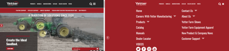
Left: In the upper righthand corner, you can see the closed hamburger menu on the Yetter Farm Equipment website.
Right: The open hamburger menu.
5. Include eye-catching media on your home page.
One trend that continues to prove successful is having eye-catching movement on your home page. It makes for an exciting, memorable first impression. Here are a few examples we’ve implemented on our clients’ websites:
- Photo carousels
- Animated slideshows
- Short, looping videos
When implementing these options, it’s important to be smart about sizing so page load speed is still within an acceptable range. When handled properly, photos and videos are an excellent way to make key products or brand selling points the first thing people see when they drop into your website.
6. Use illustrations and icons.
Ever since the emergence of emojis, there has been a trend toward communicating with symbols and icons, rather than just words alone.
When text stands on its own, it may not be enough to draw a reader in. But a simple illustration or icon above a section of text or in place of a photo can go a long way! Beyond standalone icons or illustrations, consider communicating complicated information that includes data and comparisons in an easy-to-understand infographic.
Whether you’re ready to take the plunge into a website refresh or need a full redesign, the Write Place can work with you to create the perfect blend of your established brand and an updated style. Give us a call at 641-628-8398 or send an email to hello@thewriteplace.biz
Sources: