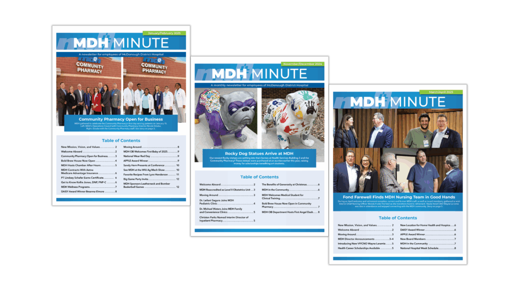
The end of the year is a great time to consider your newsletter—whether electronic or print—and see what can be done to improve it. Take a good look at your newsletter. Try to ignore the content for a moment and focus simply on the look—does it appear visually interesting, professionally designed, and uncluttered?
Practice the following concepts to improve your newsletter’s design:
- Consistency. Don’t confuse or distract your reader. While you certainly don’t want to be boring, it’s important that certain things like margins and fonts for headlines remain consistent.
- Conservation. Reign yourself in—that piece of clipart may be cool, but does it really add to your message? Use fewer fonts and go easy on frames and boxes.
- Contrast. Contrast can help important elements stand out, but still keep harmony throughout the design. For example, use a bold sans serif type for headlines and a serif for body text. Another idea is to contrast lots of text with extra white space in the margins.
Though it’s important that a newsletter look great, it’s even more important that it looks great to its intended audience. Consider the audience and the image you want the newsletter to project. A reader should be able to skim the titles, subtitles, and table of contents on the first page and know who the newsletter is written for. Image is equally important—you should know whether you want your newsletter to look casual or elegant, friendly or institutional.
If, after evaluation, you discover your newsletter doesn’t project the image you’re hoping for, but you just can’t put your finger on what’s missing, contact the Write Place. Our designers have experience creating and laying out more than 10 regular newsletters for clients in a variety of industries.
Our thanks to About.com’s article “Newsletter Design Clinic” for key concepts used in this article.


