by Moriah Morter, WP writing intern, and Lexie Thomas, Write Place owner and content expert
When it comes to color, a perfect resolution for 2024 is to be on top of trending tones! Whether you find yourself picking a stand-out accent for a book design or making a modern twist on a traditional brand palette, keeping up with color could unlock a new level of success for your brand or book.
So, what are this year’s color trends?
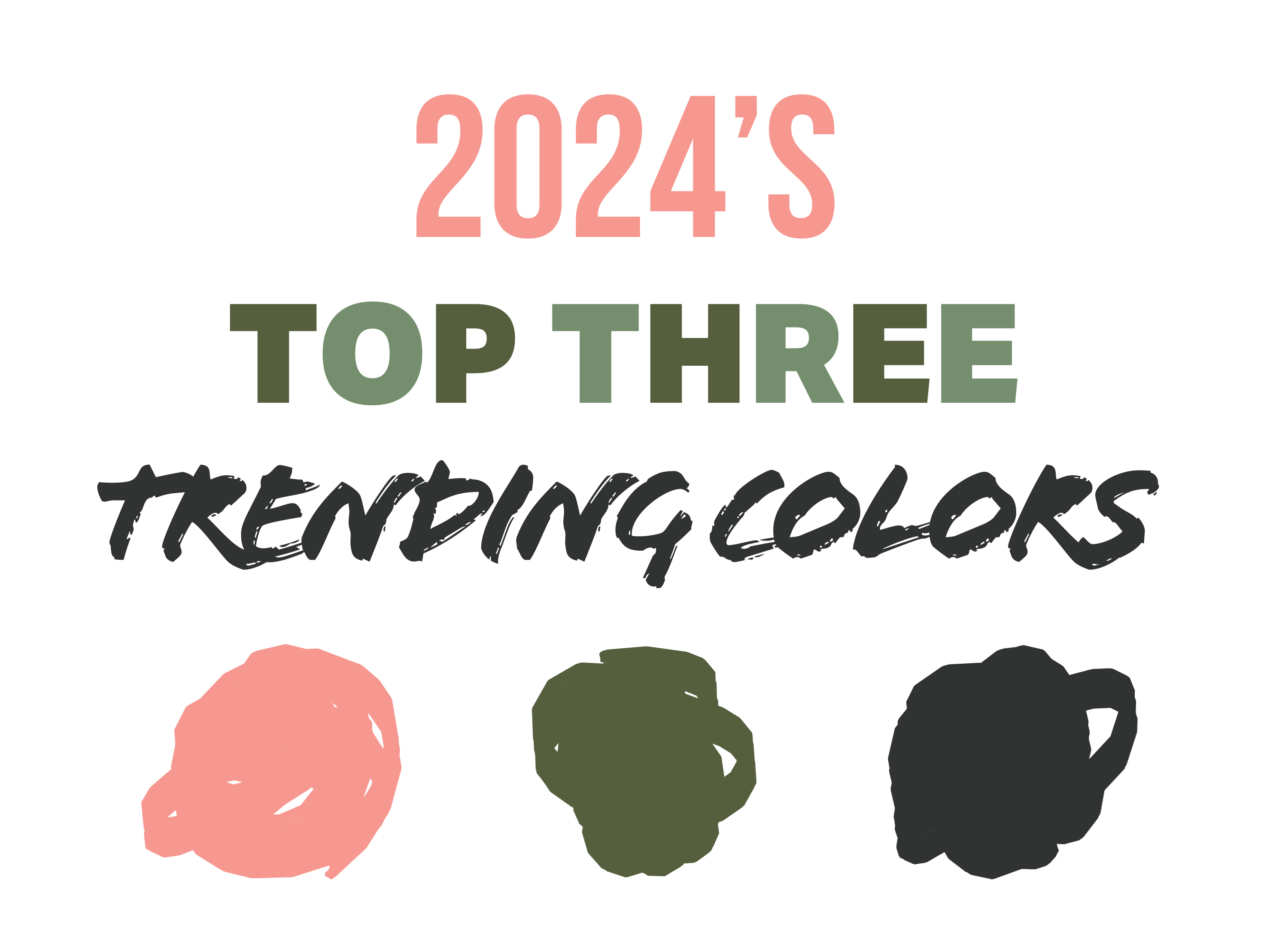
1. Peach Fuzz Pink
This year’s hottest trending color is (drumroll, please): pink! This might seem obvious with Barbie ranked as the top-grossing movie of 2023. But 2024 is leaving Barbie pink in the dust for a much more subtle shade. Take a look at the Pantone® color of the year, Peach Fuzz, and its motto: “Embrace the Warmth.” The Sherwin-Williams® color of the year, Persimmon, is a similar shade, and so is Desert Flower, one of Pantone’s New York Fashion Week picks. These shades share a pastel appearance with an orange tint that creates an optimistic and quietly energetic take on pink.
If you’re deciding how to implement pink into your brand, think nostalgia, romance, and positivity. Your soonest excuse to put pink into practice is this spring. In April or May, your social media posts, email newsletters, and even your website’s homepage could include graphics or accents with peach fuzz hues.
What book genres are a good fit for a pink cover? Romance is a clear choice for this intimate shade. A self-help book might benefit from this hue’s friendly appearance. Peach fuzz pink also lends itself well to a whimsical presentation, fitting for fantasy or magical realism. Perhaps even a thriller or mystery novel with a romantic flair could benefit—think a black background with a seductive pink accent.
2. Earthy Olives
Next on the list of trending colors is olive green. Not convinced of this color’s popularity? A similar shade—Watercress—made an appearance at Fashion Week per Pantone. Another earthy olive can be found in the James Hardie™ color for 2024, Mountain Sage. These options are characterized by a dark, earthy appearance with a recognizably olive hue.
To make use of this color in a book cover, think nature, relaxation, and freshness. Earthy olive could be the perfect background for a thoughtful memoir, literature with a focus on self-reflection and meditation, or a guide to gardening.
For brands looking to implement olive tones, this color speaks fall. Consider using this tranquil green toward the end of August and into September and October. For social media content, try implementing this shade in backgrounds, in text on graphics, or as an overlay.
3. Cracked Pepper
Last but certainly not least in trending colors is Cracked Pepper by Behr®. With an edgy flair but overall cozy appeal, Cracked Pepper is a step lighter than black, but it shares similar alluring qualities. Behr’s color of the year was recognized by both HGTV and Better Homes & Gardens as a major color in 2024’s trend forecast.
Does your brand’s logo look good against black? If so, try swapping out that black background with a deep gray to give your brand an updated look. Lighter images, text, and graphics can all be placed on Cracked Pepper’s versatile stage. If your brand’s colors are lighter, use this almost-black as a bold accent.
For books, a moody mystery novel or gritty thriller could very easily fit in a jacket with a Cracked Pepper background. A book on modern architecture may be given a high-class air if you place deep-toned gray text against a clean white background. The dark color could also be used to make a book of poetry appear solemn and heavy.
Implementing trending colors into your brand
If you’re wondering how to make trending colors work with your brand, remember to use your standard logo colors as a guide. It’s more important to use trending shades in a way that heightens the look of your brand than it is to temporarily incorporate fads.
Here’s some quick guidance on color harmonies for these trending colors:
- Brands that are primarily black, white, gray, olive green, navy blue, turquoise, or purple would be able to successfully use this year’s trending pink.
- If your logo colors are yellow, bright green, or orange, avoid peach fuzz colors.
- Earthy olive plays nicely with brands that feature black, gray, white, cream, brown, or dark red.
- Avoid using olive green with other greens, bright yellow, or turquoise.
- The most versatile trending color is Cracked Pepper. It can be used successfully as long as the brand color you’re pairing it with is light enough that contrast is maintained.
If you find yourself needing to dust off your brand with some fresh colors or would like professional insight on the most fitting color choice for your book cover, feel free to contact the Write Place at 641-628-8398 or send an email to hello@thewriteplace.biz.
Sources:
- Pantone Fashion Color Trend Report: New York Fashion Week Spring 2024 (Pantone)
- 2024 Color of the Year (Behr)
- 2024 Trend Forecast (Dutch Boy)
- Every 2024 Color of the Year We Know So Far (Better Homes & Gardens)
- Trend Forecast: 2024 Colors and Palettes of the Year (HGTV)


