by Lexie Thomas, WP owner, and Vera Snodgrass, WP writing intern
Whether it’s for online marketing, internal reports, or presentations, having polished visual communication is crucial for today’s brands. Thanks to our digital world, consumers are presented with and have easy access to a mountain of information—information they want to quickly review and assess. In fact, according to a Demand Gen report, 91% percent of today’s audiences say they want visual content above anything else.
It makes sense. When visuals are done well, readers can digest the meaning of the information more quickly, because our brains process visuals thousands of times faster than any other form of communication. Data presented in a visual format is more memorable. When visuals are combined with text, we’ve given the brain two layers of information and enhanced its ability to store the message. Compared to text alone, text combined with images improves comprehension by up to 85%.
Visual communication is about effectively using techniques like charts and infographics to engage your audience, tell a story, and give meaning to data, with as little text as possible. Designers need to understand data visualization, make proper chart and comparison choices, and choose graphics strategically. It’s a learned skill.
No matter what kind of visual communication you’re working with, your visuals need to use your brand’s fonts, colors, mood, and graphic style. Premade infographics or charts from free and low-cost online sources may fit into a brand’s aesthetic, but most often the best path for your brand is to work with marketers and designers who understand data visualization and can create custom pieces that follow your brand’s standards.
So, now that we’ve established the reasons visual communication matters, let’s dig a little deeper into three types of visual communication the Write Place most often creates for our clients: data sets, presentations or slideshows, and infographics.
Dealing with Data
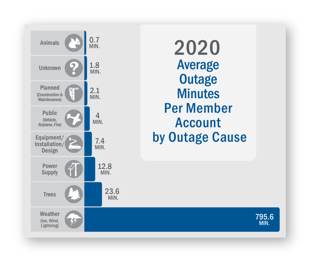
This bar chart we created for East-Central Iowa Rural Electric Cooperative succinctly communicates average outage minutes by cause for 2020.
Assessing a spreadsheet that’s heavy with numbers is tough for those who don’t deal in financials and data on a daily basis. There are often audiences outside this circle that our clients need to reach. The Write Place can step in and help create charts, diagrams, and tables, breaking the data into digestible subsets.
By tying the numbers to visuals, the audience grabs onto complex ideas quicker. Using visuals like pie charts to show the composition of something or a bubble chart to show relationships turns raw data into a story. These “data stories” have more staying power (and are certainly more interesting to look at!) than a spreadsheet.
You might be asking, “Why can’t I use the charts right from my spreadsheet program?” That is an option, but using a designer brings a more creative and polished aesthetic, and that makes your audience more likely to spend time on your data.
Invaluable Infographics
Sometimes you have plenty of data or facts to share, and it makes sense to showcase it all in a more creative way. This is where infographics come in. Infographics are rich with data while also showcasing connections in a fun and engaging way. They often incorporate more text.
Infographics can be used to raise awareness for a specific issue, showcase the impact of an event or project, and inspire deeper thinking through visual metaphor. Designers with experience in infographic creation know how to make sure the graphics and concepts support your message instead of distracting from it.
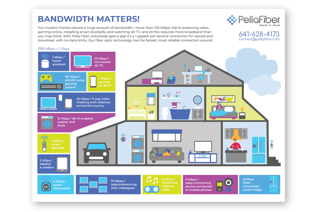
This infographic for Pella Fiber breaks down a complex topic—why modern homes require a huge amount of bandwidth—in a way that’s easy to understand.
Precise Presentations
Charts, diagrams, and infographics are all excellent tools to integrate into presentation decks. Slides with too many words are distracting for your audience, forcing them to choose between listening to you speak and reading your slides. The end result is split concentration and low message retention.
When styling your presentation, make sure you customize the template for your brand. Don’t let all the options for fonts, transitions, and backgrounds get in your way. Simple is best.
Once you’ve pruned your slide text and style, layering in those visual communication elements is icing on the cake.
Visual communication is all about clarity and a laser focus on your message. A strong commitment to incorporating visual communication is an asset to any business, helping you cut through the noise in today’s information-heavy world.
If you need help building on-brand visuals—icon sets, infographics, bar charts, and more—the Write Place team can help! You can reach us at 641-628-8398 or send an email to hello@thewriteplace.biz.
Sources:
- What is Data Visualization? (Definition, Examples, Best Practices) – venngage.com
- e-Learning and the Science of Instruction by Ruth Colvin Clarke and Richard E. Mayer
- Presentation by Amy Balliett, Senior Fellow of Visual Strategy