By Michelle Stam, WP graphic designer
PowerPoint is a tool you’ve probably used for your business’s presentations, possibly over and over again. It’s a great program, and it’s fairly simple to use. But have you ever taken a step back to really consider how effective your presentations are?
If you’re creating a slide deck, you’ve got a lot of facts and figures in your head about the topic you’re presenting. You want to be seen as an expert. The trouble is, this leaves you focused on the amount of information you want to put on your slides and not on HOW that information is presented. When you get in this rut, it’s easy to unintentionally make viewers work hard to follow everything that’s packed onto one slide.
So, what to do? Here are some tips from a recent course I took on effectively building PowerPoint slides.
Write your text first
Complete the text and outline what will be on each slide before creating your PowerPoint presentation. This prevents unnecessary headaches and results in a more organized presentation.
Only put the most important information on the slides for the audience to see and place the rest of the text in the presentation notes so you can cover it as you’re speaking. When the speaker has additional value to add beyond what the audience can read on the slide, they’ll stay tuned in.
 Use master slides for consistent branding
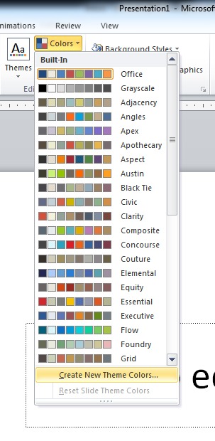
In order for your presentation to look professional, all the slides need to have a consistent look. The easiest way to do this is to create a master slide with your logo and brand colors. You can make variations of the master slide to fit your needs, such as applying consistent animations, text spacing, and fonts throughout the whole presentation. If you know your brand colors, it’s easy to create a new color palette that uses them. Once created, you can set it as your default color palette for the presentation. Creating master slides can take a bit of work, but it will keep you from getting frustrated as you try to keep things consistent, and it will save you time in the long run.
Side note: If your brand has a unique font you want to use, make sure to embed it into the presentation. If you don’t, the font will show up as a default font on any computer that does not have your unique font. This will dramatically change the look of your presentation . . . and it won’t be for the better!
Divide topics onto more than one slide
Don’t fall into the common trap of placing too much information onto one slide. You don’t have to use only one slide for each topic you’re covering. Break it up into multiple slides.
Animate your bullet points
Most PowerPoint presentations use bullet points to present important pieces of information. Animation is your friend, especially on slides that may still have the potential for information overload. Choose settings that allow only one bullet point to show at a time. This keeps the audience from having to work hard to read all the points at once, and the motion of the animation keeps them engaged.
 Add action shots
Photos add interest, especially if they are action shots that correspond with the content of the slide. Action shots can be used on part of the page or as the background. When used as the background, they are most effective on slides that do not have much text. On title slides, for example, they will help grab your audience’s attention from the start of the presentation.
Caution: Only place text where it will be legible over the photo. You may have to add a semi-transparent box or gradient behind the text to make sure it stands out from the background.
Use a grid layout for multiple items
Grids help organize items on a slide so they don’t look randomly placed. If a slide, for example, needs to have multiple sponsor logos on it, using a grid will help organize them and keep the logos the same relative size.
Writing and designing PowerPoint slides is more complex than it seems. If you’re looking for another perspective or don’t have the time to create slides that fully showcase your business, contact the Write Place. We can help order and edit your text as well as design custom graphics that build your brand.
Source: Cheating Death by PowerPoint for Designers, HowU Workshop by Laura Foley


