by Michelle Stam, WP graphic designer
The cliché “Don’t judge a book by its cover” is great advice for life … not so much for authors approaching book cover design—one of the most exciting and daunting stages of publication.
As readers, when we’re scanning shelves (or scrolling online, in these days of social distancing), we absolutely judge books by their covers. The cover is almost always the first thing to capture our eye, to entice us to pick up or click on a book and learn more about it. So first and foremost, it’s key to have a well-designed cover that stands out from the crowd. At the same time, your cover must squarely position your book within its genre and accurately represent its contents. A mismatched cover can leave readers feeling confused and annoyed, like they purchased a book under false pretenses.
In short, a lot depends on your book’s cover. So how can you ensure your cover design works? Over the years, Write Place designers have created over 100 covers for books of many different genres. We’ve found there are seven basic guidelines that lead to a successful book cover.
1. Have a clear but intriguing title.
The title needs to give the reader a hint of what the book is about. Be careful not to be too vague—this will leave your reader confused, especially if it’s a nonfiction book. A good title hints at what the story might be, telling the reader just enough to draw them in.
2. Carefully choose typography.
There is more to putting the title on the cover than picking a font and typing it out. Cover designers often pay attention to each letter and the space around it in your title. The weight and size of each word matters—the larger, heavier words give necessary hierarchy and meaning to the reader. Not all the words need to be in the same font, but there should be reasons behind these choices. Letterspacing adjustments are subtle but important. They can elevate the font and feel of the cover. Playing with symbols and letter embellishments within the lettering is also a go-to professional technique fitting for some books.

3. Choose images that send the right message.
Images on book covers—whether they are photos or illustrations—should represent the content of the book. If the image focuses too narrowly on one specific part of the book, readers will feel betrayed when they realize what they thought the book was about isn’t a theme throughout. If your book is illustrated, the best route is having a specific illustration created for the cover. When a cover illustration is not available, we’ve created a unique scene using elements from multiple illustrations.
The title of a book should always be legible if it is placed on an image. That means it must be strategically placed and, if necessary, the image faded out behind it.


4. Whenever possible, use photography or artwork you have created or commissioned.
Using something unique to your book is always the path we prefer because it gives the author and designer the chance to create the perfect cover story without compromise. Be sure to share with the professionals you are working with that the images will be used for a book cover, so you have the proper agreements in place. Stock images are also an option. It’s crucial you fully read the license agreement that comes with the image and are aware your image may show up on another book cover.

5. Choose images that aren’t too busy.
It’s important readers don’t get so distracted by the cover image they completely miss the title. Sometimes the book designer will purposefully weave the image and title together, but a good designer will make sure the title is still readable.
6. Don’t use too many images.
In some instances, multiple images can work very successfully on book covers, but in general it’s best to stick to one or two. Remember that even though cover imagery needs to be applicable to the book, you don’t need to show the whole story on the front cover. If you have multiple images you’d like to use, select one or two for the front cover and explore how to tastefully use more images on the back cover.
Also, covers don’t need images to be successful, especially for nonfiction books. Well-placed typography on a solid background is a great alternative to help your book stand out.


7. Use colors that send the right message.
People associate colors with emotions, so it’s important to know what message the color of your cover will send to your readers. Most people know red is an aggressive color that demands attention. But what about the rest of the colors? Below is a helpful diagram of the theory of color. Sometimes it’s necessary to put personal preference aside if the color you’re drawn to isn’t going to send the right message to your readers.
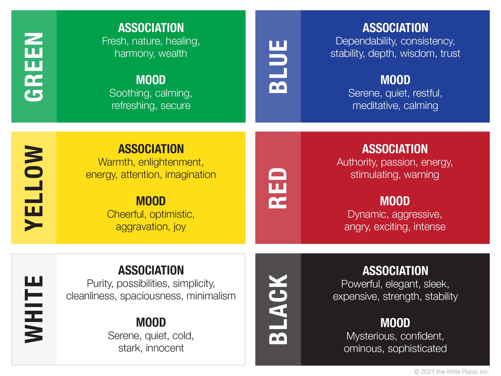
It’s good to note that the association and mood of a color can change, depending on how much of the color is used. You may have noticed the mood for yellow is both “aggravation” and “joy.” These things are opposites, so how does that work? In moderation, yellow evokes joy. But if overused, it can lead to feelings of aggravation.
Yes, your book will be judged by its cover. And while that may sound scary, it doesn’t have to be. The judgment may be, “That book looks cool. I’m going to buy it!”—especially if you follow these seven guidelines.
If you’re interested in working with a professional cover designer, check out the Write Place’s cover design packages and full range of publishing services. You can also email Book Division Coordinator Sarah Purdy at sarah@thewriteplace.biz.